
Hot Math: A Nice Opportunity to Apply Probability to Current Events
According to one large integrated model that combines empirical data with other scientist’s forecasting models, the global daily temperatures on the 17 days from July 3 through July 19 were the hottest on record and likely the hottest in the last 120,000 years. How likely is this string of daily extreme events?
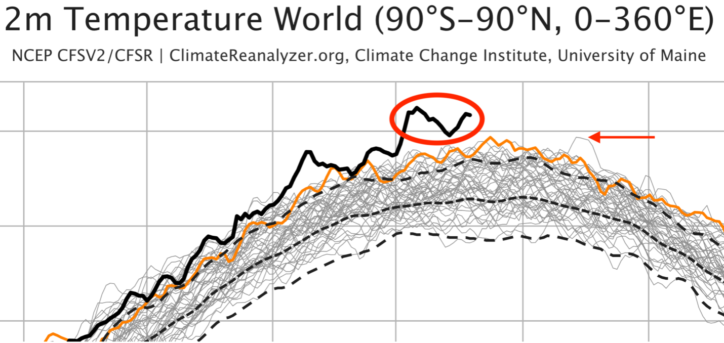
Figure 1. The red oval highlights the recent streak of unprecedented global mean temperatures in July 2023. The red arrow indicates the previous high on August 13 & 14, 2016. The orange curve is for 2022 and the three dashed lines indicate the 1979-2000 mean and the associated ±2s bounds. See Figure 2 for the axes’ labels.
Wait a second… how do you take the globe’s temperature? That in itself is an excellent modeling prompt that can be approached by a wide range of students and at various levels of mathematical sophistication. It quickly raises questions of how to average data across both spatial and temporal dimensions. How much of the earth is at what temperature and for how long is a place at a particular temperature? Without the benefit of constant pervasive measurements, across both space and time, some simplifying assumptions need to be made.
Wrestling with these questions is a valuable exercise for students before introducing them to the data visualization displays provided by the Climate Change Institute (CCI) at the University of Maine. The CCI produces these visualizations and provides the publicly available data sets they are based on with the clarification that the data are from complex syntheses of empirical measurements and climate forecasting models. The CCI also explains that isolated extreme events could be due to a multitude of factors and are not “official” records.
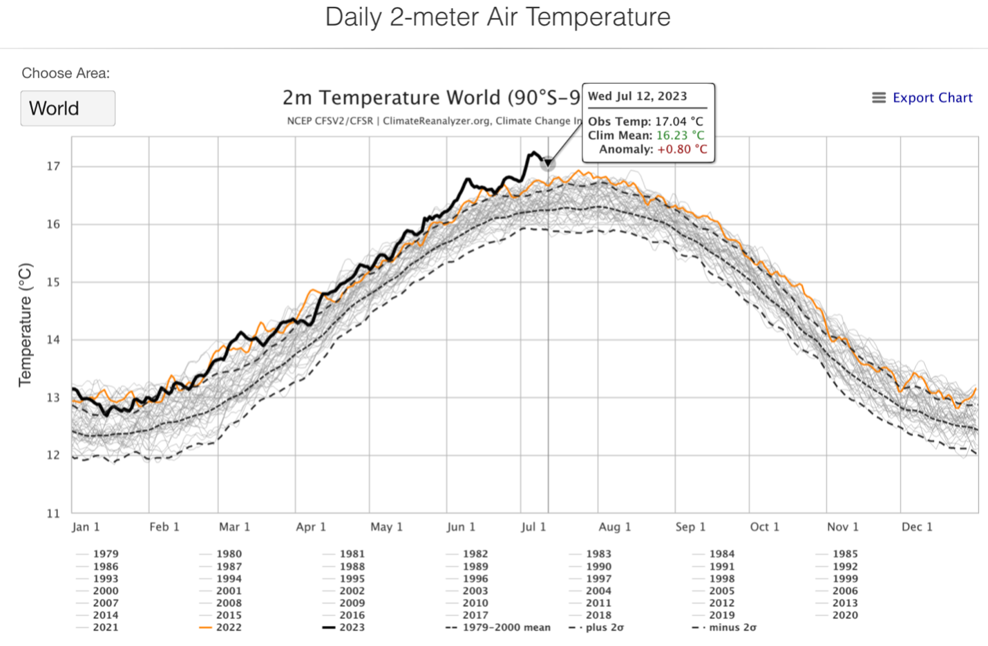
Figure 2. The interactive chart from which the enlarged portion in Figure 1 was taken.
The visualization tool is very powerful. For example, you can select which years you want to look at, either in isolation or in smaller groupings. In Figure 3, the mean, ±2s bounds, and data from 2023, 2022, and the five years from 1979 through 1983 are shown.
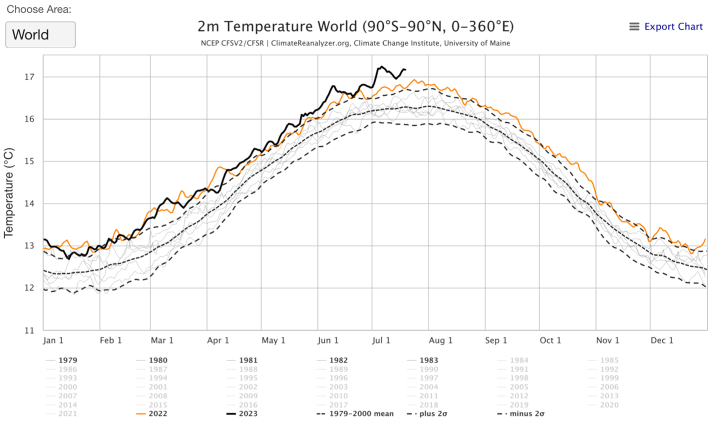
Figure 3. Users of the visualization tool can select various subsets of the data.
In addition to interacting with the visualization tool, students can download and work with the raw numerical data. Figures 4 & 5 compare the twelve years 1979 through 1990 with the twelve years 2012 through 2023.
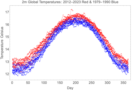
Figure 4. A plot based on numerical data downloaded from the CCI website.

Figure 5. Means of the two data sets plotted in Figure 4.
Is it getting warm in here?! Turns out our opening question is also a rather complex one as the likelihoods of extreme events are in relation to a changing climactic system. Students can’t use a simple probability box model and assume the samples come from the same box. Engaging and timely questions abound. Happy modeling!
Reference: https://climatereanalyzer.org/
Written by
COMAP
The Consortium for Mathematics and Its Applications is an award-winning non-profit organization whose mission is to improve mathematics education for students of all ages. Since 1980, COMAP has worked with teachers, students, and business people to create learning environments where mathematics is used to investigate and model real issues in our world.